How to format LinkedIn posts so people actually read them

Kristo Olli
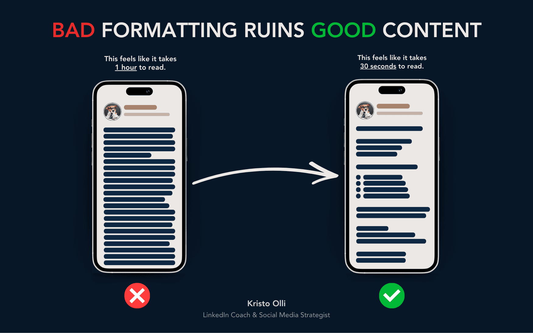
Harsh truth about social media: people don’t read your content, they scan it.
This means you could have the best idea in the world, but if your post looks like a wall of text, no one’s going to read it.
Formatting isn’t about looking nice. It’s about making your content easy to digest – helping the reader’s brain say, “I can handle this.”
The goal is simple: make it effortless to read, even for someone scrolling on their phone between meetings.
Here’s exactly how I format my LinkedIn posts (and how you can too).
1. Keep paragraphs short – 3 to 4 lines max
Massive text blocks are the #1 reason people scroll past your post.
Short paragraphs keep momentum high and make your content look approachable.
Think of it like this: every line break is a breath. Without them, you’re suffocating your reader.
✅ Here’s what works:
Keep paragraphs to 3–4 lines on mobile view, not desktop
Leave a blank line between every paragraph
Don’t be afraid of white space – it gives readers room to pause
Example:
❌ “I believe personal branding is important because people buy from people and sharing your expertise helps build trust and visibility and… [endless sentence].”
✅ “Personal branding matters.
Because people don’t buy from faceless companies – they buy from people they trust.”
Shorter. Cleaner. Easier to read.
Your reader should never feel trapped in a block of text.
2. Use bullet points
Any time you’re listing something, use bullet points.
People’s eyes love patterns.
Bullet points break up your post, create rhythm, and make scanning easy.
✅ Use bullet points when you:
Summarize advice or takeaways
Show examples or comparisons
Want readers to grasp your main point fast
Example:
Instead of:
“To grow on LinkedIn, post consistently, engage with others, and improve your profile.”
Try this:
To grow on LinkedIn:
Post consistently
Engage with others
Optimize your profile
Cleaner. Quicker. Easier to digest.
When people can scan → they stay longer → engagement goes up.
3. Go easy on hashtags, emojis, and tags
If your post looks like a Christmas tree, it’s time to trim it down.
Yes, emojis can add personality, but too many distract from your message.
And hashtags? They’re not the magic engagement hack they once were.
✅ Keep it simple:
Use emojis sparingly – only when they really help you emphasize the emotion / are relevant
No need to use hashtags at all, but if they're part of your DNA and you can't function without them, please stick to 3–5 hashtags max and add them at the end of your post
Tag people only when it truly adds value
You want people focusing on your message, not all the decorations around it.
Why formatting matters
Good formatting = more people reading = more people engaging.
Here’s why:
1️⃣ It makes your content look easy.
Most people scroll while multitasking. If your post looks digestible, they’ll stop to read.
2️⃣ It builds trust subconsciously.
Clean, organized posts feel more professional – even before someone reads the words.
3️⃣ It supports your tone.
Line breaks, spacing, and rhythm make your writing sound natural and human.
Your formatting is part of your message.
The psychology behind scanning
79% of people scan online content instead of reading word for word (Nielsen Norman Group).
So you’re not writing essays – you’re writing for skimmers.
People don’t owe you their attention. You have to earn it.
👉 Quick tips for scannability:
Start with a strong hook (1–2 lines)
Keep sentences short – max 12–15 words, vary
Use white space generously
Add a clear takeaway at the end
Your goal isn’t to make posts shorter – it’s to make them look shorter.
Common formatting mistakes
🚫 Big text blocks
Nothing kills engagement faster than endless paragraphs.
🚫 Too much decoration
Too many emojis, caps, or tags distract the reader.
🚫 Formatting for desktop only
What looks fine on a laptop can look messy on mobile.
🚫 Hashtags everywhere
They break rhythm – keep them grouped at the end.
🚫 No rhythm or flow
Your post should have pauses, spacing, and emphasis – just like how you’d speak.
Formatting isn’t just about structure – it’s visual storytelling.
The structure I use for every post
If you’ve ever wondered, “How does Kristo make his posts so easy to read?”, here’s a simplified formula:
🧠 Hook: 1–2 short lines to grab attention
📄 Body: 3–4 line paragraphs with spacing
📋 Bullets: whenever listing or comparing
🪶 Voice: write like you’d explain it to a friend
✨ Ending: one key takeaway or question to invite comments
Simple. Repeatable. Effective.
Once you get used to writing like this, it becomes effortless.
Advanced tip – format for emotion, not just logic
Formatting isn’t only for clarity – it’s for impact.
You can use spacing and pacing to create emotion and rhythm.
Example:
“I almost quit creating content.”


